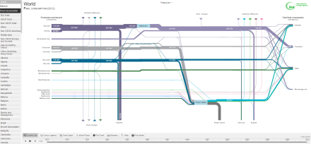
One of the previous posts focused on Sankey diagrams. Since then, I discovered a great online and interactive webtool by the IEA (International Energy Agency) that provides national and the world’s energy balances (and final consumption).
This interactive tool visualises the energy balances from 1973 to 2012 and allows you as well to add some supplementary time graphs, pie charts, to move around the flows and finally your search results. Great results to include in reports and research.