Do you know MetabolismOfCities.org ?

Are you an urban metabolism fan? Are you also fascinated about the complex functioning of cities and by the way they mobilise energy, water and material flows across the globe? Are you searching for a concept that could help cities become more sustainable and achieve Sustainable Development Goals (SDGs) and the legally binding Paris agreement?

Then you will most certainly be interested by MetabolismofCities.org. A while ago, we created (see the team here) an online and open-source initiative that gathers data, people and information around the field of urban metabolism but also industrial ecology, material flow analysis (MFA), and other fields that gravitate around urban environmental assessment.

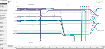
Urban metabolism is a notion that compares urban areas with living organisms which need resources for their functioning and generate waste during the consumption and transformation of the former. This analogy was used by different disciplines across the decades but since the pioneering study of Abel Wolman in the Scientific American in 1965 (The Metabolism of Cities), it is mainly used to better understand and assess the environmental performance of cities. It focuses on describing flows entering and exiting urban areas (energy, water, materials, waste, pollution emissions, etc.) and stocks (buildings, infrastructure, cars, etc.). By quantifying and analysing these flows, it becomes possible to monitor the environmental performance of cities, their progress towards a more (un)sustainable state but also to think of and implement systemic and comprehensive environmental policies.

However, establishing a metabolic balance for an urban system (i.e. collecting all the necessary data of all the metabolic flows and stocks) can be very time-consuming. For instance, almost four years ago and in the case of Brussels, it took me slightly more than 3 months to make a first approximation of its metabolic balance. This was only for the year 2010! Nevertheless, once you know the data sources, it is relatively easy to do the same exercise for other years (mostly the recent ones). One problem remains. Even if you have searched for and gathered all this data on your computer on a number of excel sheets, if someone else wants to do the same job, it will still take them the same amount of time (unless if you publish your results in an article, report or on the net). In addition, if you want to compare your results with another city, you will have to start all over again this data and publication collection exercise.

The idea behind the Metabolism of Cities was to streamline the process of doing an urban metabolism by creating an online and free tool, to collect publications on urban metabolism, gather all experts of the field and finally create a global database collecting metabolic data from different cities around the world (coming from the aforementioned publications).

The following screenshot (to access the map, click on the screenshot) shows a brief overview of all the urban metabolism studies we have gathered so far. By clicking on the dots you can access the studies details.

MoC map

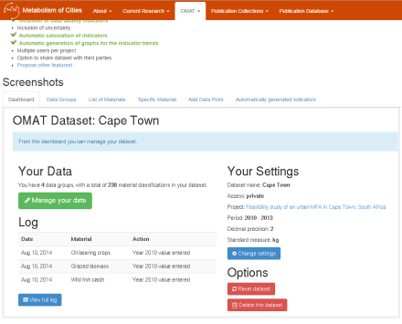
One other major contribution of this platform is the OMAT tool that helps to streamline the establishment of an urban metabolism balance. You can make a public or private project where you input all your data, include their sources but also visualise your results!

OMAT MoC

To compare your findings with other cities or studies the urban metabolism publications database has collected 300+ publications. The entire list can also be downloaded in a .csv file to create an easy to use literature review.

UM Publications MoC

The last aspect that we want to develop is the global urban metabolism data database where data from all the abovementioned studies will be centralised (still in progress). Thanks to this database it will become possible to compare different cities, for a number of metabolic indicators, for different points in time, etc.

Still a lot things are being/ will be developed but this generally takes some time (so far the work is done thanks to a small team of volunteers). If you are interested in this platform don’t hesitate to chat with  us, share anything you think is relevant, or even join the team!

For more info, visit MetabolismofCities.org and contact us.

Urban metabolism visualisations are coming

New year, new resolutions? We’ll see about that. In the last month or two, I didn’t have much time to post something new. However, a number of posts are in the pipeline (this is  the resolution bit).

In fact, during the last months I took two courses of D3.js (a javascript library that allows to create online and interactive data-driven visualisations) with the Knight Centre for Journalism.

I have to admit that they took a big chunk of my free time but I got to do a number of visualisations (or at least try) on different facts of the Urban Metabolism of Brussels.

All of these visualisations, can be seen here http://bl.ocks.org/arisatha. I still haven’t found a way to embed those directly within this blog, so I’ll add some screenshots  that will make links to the more “interactive” viz.

In the coming weeks, I’ll try to add a small story to each of these visualisations (around 10). If you have any suggestion about new viz, the data used or whatever, let me know.


The urban ecosystem of Brussels – Explained

If you have ever heard of urban metabolism or urban ecosystems, this is one of the first studies/images you have probably seen:

P. Duvigneaud

This was done by P. Duvigneaud and S. Denayer De-Smet back in the 1970s and represented in the urban ecosystem of Brussels. It is largely recognised and cited as one of the seminal and most comprehensive studies in urban ecology and urban metabolism.

This study presented several subsystems of the urban ecosystem and highlighted its unsustainable functioning in a very synthetic and graphically appealing visualisation. However, at first glance this illustration is highly complex and not very accessible. If you have also struggled to figure out what all these numbers mean, well this post will disaggregate the different subsystems of this study in order to make it slightly more legible.

Energy balance

The first element presented in this study is the natural energy balance of Brussels. This represents natural energy received on the entire territory of Brussels (130.10^12 kcal), the export of energy reflected by Brussels’ surface  (27.10^12 kcal), the import of energy due to atmospheric radiation  (390.10^12 kcal) and the export of thermal energy due to soil radiation  (435.10^12 kcal). The global balance of natural energy is therefore equal to  58.10^12 kcal

Ecosystem energie naturelle

The second element mentioned in this study is the subsidiary energy or the imported energy that is coming directly from the sun. As no accurate data where available, Brussels imports of energy are estimated as 13% of Belgium’s consumption. This accounts for  26.10^12 kcal of coal, fuel, gasoline and natural gas,  4.10^12 kcal of electricity and 2.10^12 kcal of energy in the form of food.

Ecosystem energie subsidiaire

The total energy balance is therefore the sum of the balance of natural energy (58.10^12 kcal) and of the imported subsidiary energy (32.10^12 kcal) which results to an export of 89.10^12 kcal (probably this is due to rounding figures) of energy. The researchers highlight that the subsidiary energy imported accounts for approximately half of the natural energy.

Pollutants

In order to estimate the air pollution of Brussels, a full combustion of the imported subsidiary energy was assumed. This lead to  5,931.10³ tonnes of CO2, 200.10³ t of CO, 30.10³ t of SO2, 20.10³ t of SO2, 45.10³ t of hydrocarbons, 2.10³ of PM and 200 tonnes of lead. An additional 450.10³ tonnes of CO2 are added to the atmosphere through human respiration and almost a quarter of this value (138.10³ tonnes of CO2) is absorbed by photosynthesis.

Ecosystem emissions

Water balance

Similarly to the energy balance, the water balance of Brussels’ ecosystem consists as well of a number of elements divided in natural and man-made.

Annual precipitation accounted for 113.10^6 tonnes (or 113.10^9 litres) for an average precipitation height of 700 mm. The other input flow of water was imported water captured outside of Brussels’ ecosystem. This flow accounted for 61.10^6 tonnes (this is an exact figure coming from CIBE).

Ecosystem eau naturelle

It was estimated that around 60% of precipitations were evacuated through runoff (60.10^6 tonnes, see figure above) and drainage (8.10^6 tonnes, see figure above). In addition, 40% of precipitations were released back to the atmosphere through evapotranspiration (45.10^6 tonnes). Finally, in addition to the 68.10^6 tonnes of water precipitations evacuated, another 57.10^6 tonnes coming from imported potable water are added to Brussels river, the Senne. Indeed, 5% of imported water (4.10^6 tonnes) is used for watering plants and therefore are going back to the atmosphere through evapotranspiration.

Ecosystem eau subsidiaire

Material flows and waste

The last section presented in this post are material flows. In this study, material flows were not studied per se. The material flows presented here in green are a direct translation from the estimation of energy flows to matter. The rest of materials entering and exiting Brussels’ ecosystem were not accounted.

Ecosystem matériaux

Similarly to some water values, waste figures (384.000 t in 1974 and 380.000 t in 1975) are precise data coming from the Conseil d’Administration. However, the figures mentioned in the text are different from the ones present in the following figure.

Ecosystem déchets

Conclusion

This seminal study allowed to underline the unsustainability of Brussels ecosystem 40 years ago. Brussels imported energy and water flows from outside of its territory while it received almost double the quantity of its inhabitant needs through natural and local flows. A recent study of Brussels urban metabolism shows that the situation has not changed (see figure below). This post wished to make the results of the original study more accessible and show that there are still relevant in the present discourse of urban ecology, urban metabolism and circular economy.

mu

Source

Duvigneaud, P. and S. Denayer-De Smet. 1977. L’écosystème URBS: L’écosystème urbain bruxellois. In Productivité biologique en Belgique. Gembloux: Scope.

BATir – ULB, EcoRes and Institut de Conseil et d’Etudes en Développement Durable. 2015. Métabolisme de la Région de Bruxelles-Capitale: identification des flux, acteurs et activités économiques sur le territoire et pistes de réflexion pour l’optimisation des ressources. Brussels: Institut Bruxellois de Gestion d’Environnement.

National and global energy balances

One of the previous posts focused on Sankey diagrams. Since then, I discovered a great online and interactive webtool by the IEA (International Energy Agency) that provides national and the world’s energy balances (and final consumption).

This interactive tool visualises the energy balances from 1973 to 2012 and allows you as well to add some supplementary time graphs, pie charts, to move around the flows and finally your search results. Great results to include in reports and research.

IEA Sankey

Melbourne’s Urban Forest

Interesting interactive map of the 70,000 trees present in the City of Melbourne (Access the Urban Forest Tree data via City of Melbourne’s new Open Data Portal data.melbourne.vic.gov.au). You can see the different tree types (genus) and their useful life expectancy.

This site also shows the different issues related with urban forest such as tree ageing, why diversity is important, participation and planning, etc.

Melbourne urban forest

Sankey diagrams

While this website is not strictly related to urban ecosystems, urban ecology or urban metabolism, it shows a very interesting way of how to visualise energy, greenhouse gases, materials, water and waste flows.

Inside this website you can find a large number of case studies.

For instance, the following one shows a study from the EEA about the energy flows across the EU-28 states in 2012 (expressed in Mtoe).

Europe_Energy_EU28_2012

This next one shows in turn the trade flows of oil and oil products flows (coming from GEA Global Energy Assessment 2012– Toward a Sustainable Future, Cambridge University Press, Cambridge UK and New York, NY, USA and the International Institute for Applied Systems Analysis, Laxenburg, Austria)

gea_report_oil_trade_sankey

Urban Metabolism of Six Asian Cities – cont’d

In the very interesting report mentioned in the previous post, the authors include not only very thorough and complex results but have also found a very illustrative and synthetic way to present them.

The following dependency wheel shows the Direct Material Input of Bangalore in 2001. On the left, is shown the amount and percentage of materials (BM = Biomass, CF = Chemical and Fertilizes, FF = Fossil Fuels, MM = Metallic Minerals, NM = Nonmetallic minerals, O = Others) used by Bangalore. On the right are represented the economic sectors (SO1 = Agricultural and mining, SO2 = Biomass-related products, SO3 = Chemical and fuel products, SO4 = Construction products, SO5 = Metallic products, SO6 = Machinery and equipment, SO7 = Utilities, SO8 = Construction, SO9 = Services, SEXP = Exports, SFC = Final Consumption, SGFCF = Gross fixed capital formation) and how much material input they use. Finally, the dependency wheel shows how different materials are used by different economic activities/sectors.

For instance in red, it is possible to see that 40% of the Biomass input of Bangalore is used by the Biomass-related products, 10% is used by the Services, and approximately 40% is used in Final Consumption.

urban-metabolism-six-asian-cities contd

Urban Metabolism of Six Asian Cities

A year ago, the Asian Development Bank published this report which was prepared by the Instituto Superior Tecnico of the University of Lisbon.

urban-metabolism-six-asian-cities

In this report a streamlined urban metabolism approach was used and applied to six Asian cities – Bangalore, Bangkok, Ho Chi Minh City, Manila, Seoul and Shanghai. This approach overcomes the lack of data at city level and provides a synthetic view of material flowing within and through these urban economies during the year 2001.

MFA-Tools

This opensource website created by Paul Hoekman presents a collection of more than 220 projects and publications across the world (at country, city and other scales) that deal with Material Flow Analysis, Urban Metabolism, Ecological Footprint, Life Cycle Analysis, …

MFA-tools.net

You can easily download this publication database and use it for your projects or curiosity.

This website also offers an online material flow analysis tool (OMAT) that helps you to create, save and share your database privately and publicly.

If you want you can also contribute to this website by adding more publications, data and research projects (including your own) in order to create a huge open database that gathers information about resource use, environmental impacts, accounting methodologies and many more.

MFA diagrams

Have a look at the blog of Nels Nelson that has collected a number of MFA (Material Flow Analysis) Diagrams. These diagrams show the exchanges of matter through different (sub-)systems ranging from industrial processes to cities and nations (see below). The diversity of diagrams shows how diverse the representation of complex phenomena can be.

MFA-India[2]